
Your cart is empty!
This logo design was done for a construction company
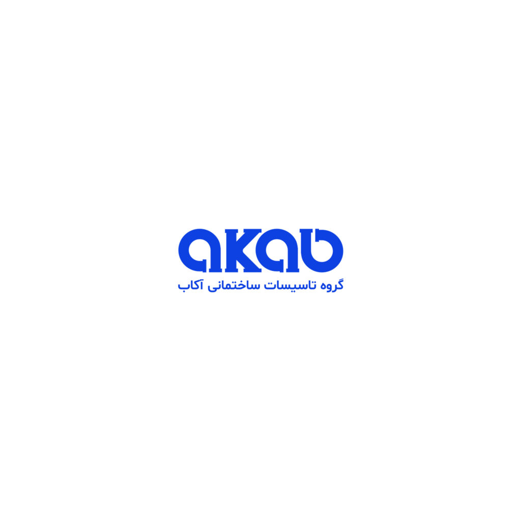
The initial idea was like this, since water piping is flexible, we wanted to show this feeling in the design with the circles inside the logo.
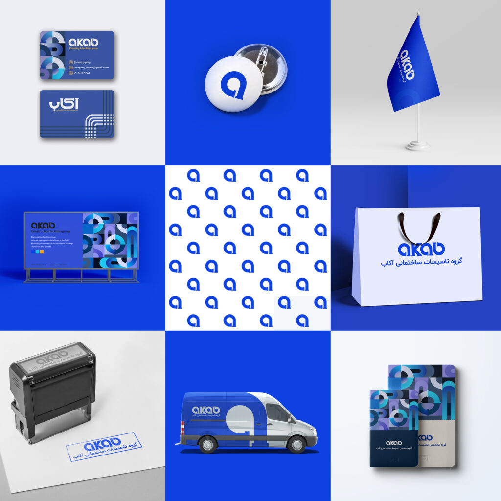
Also, we wanted to use the main symbol of the tube in the design, but not in a stereotypical and direct way, so we included and implemented this idea inside the logo and design.
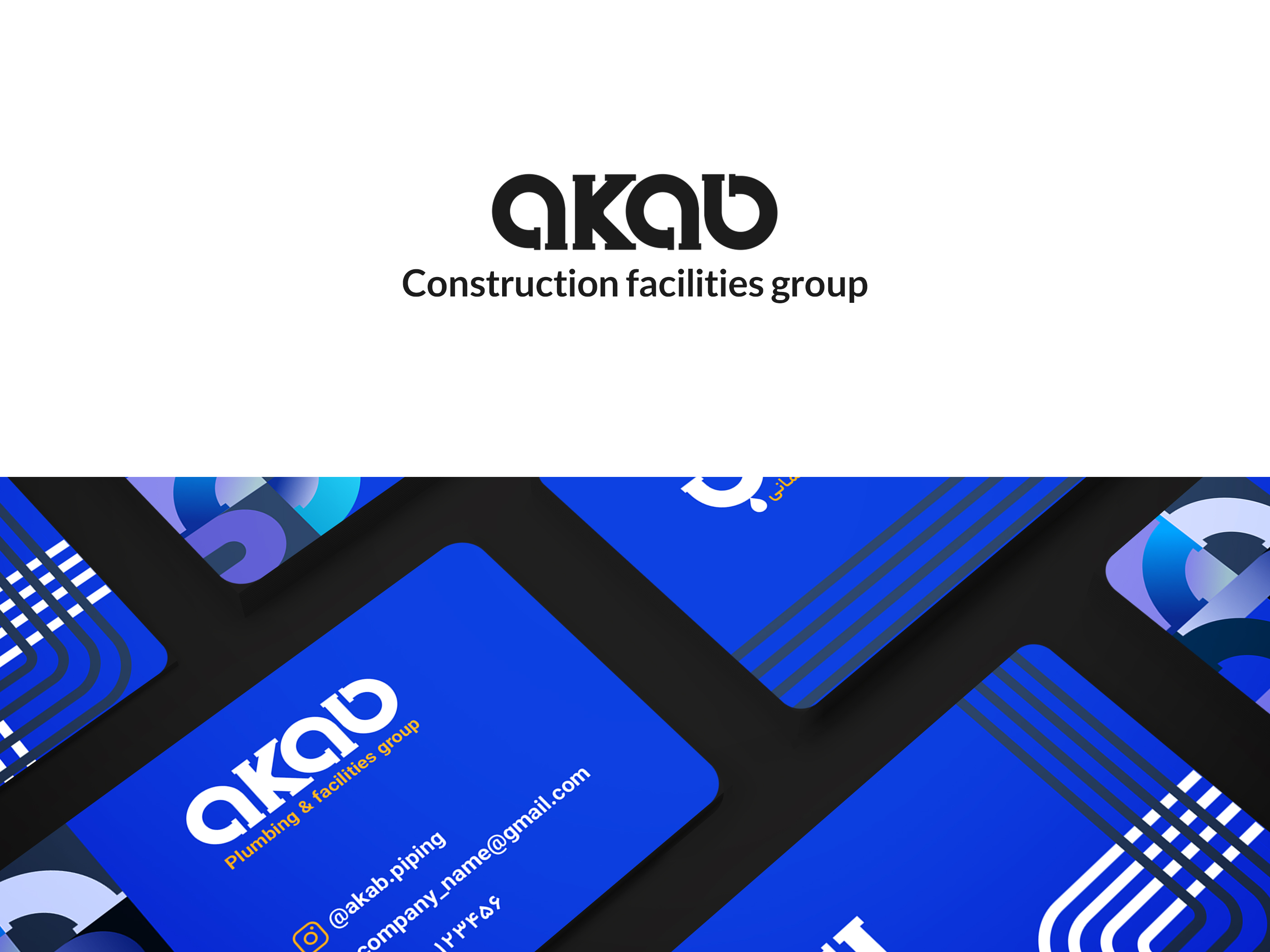
The color blue, which has both a corporate state and is the best color for the symbol of water, was chosen
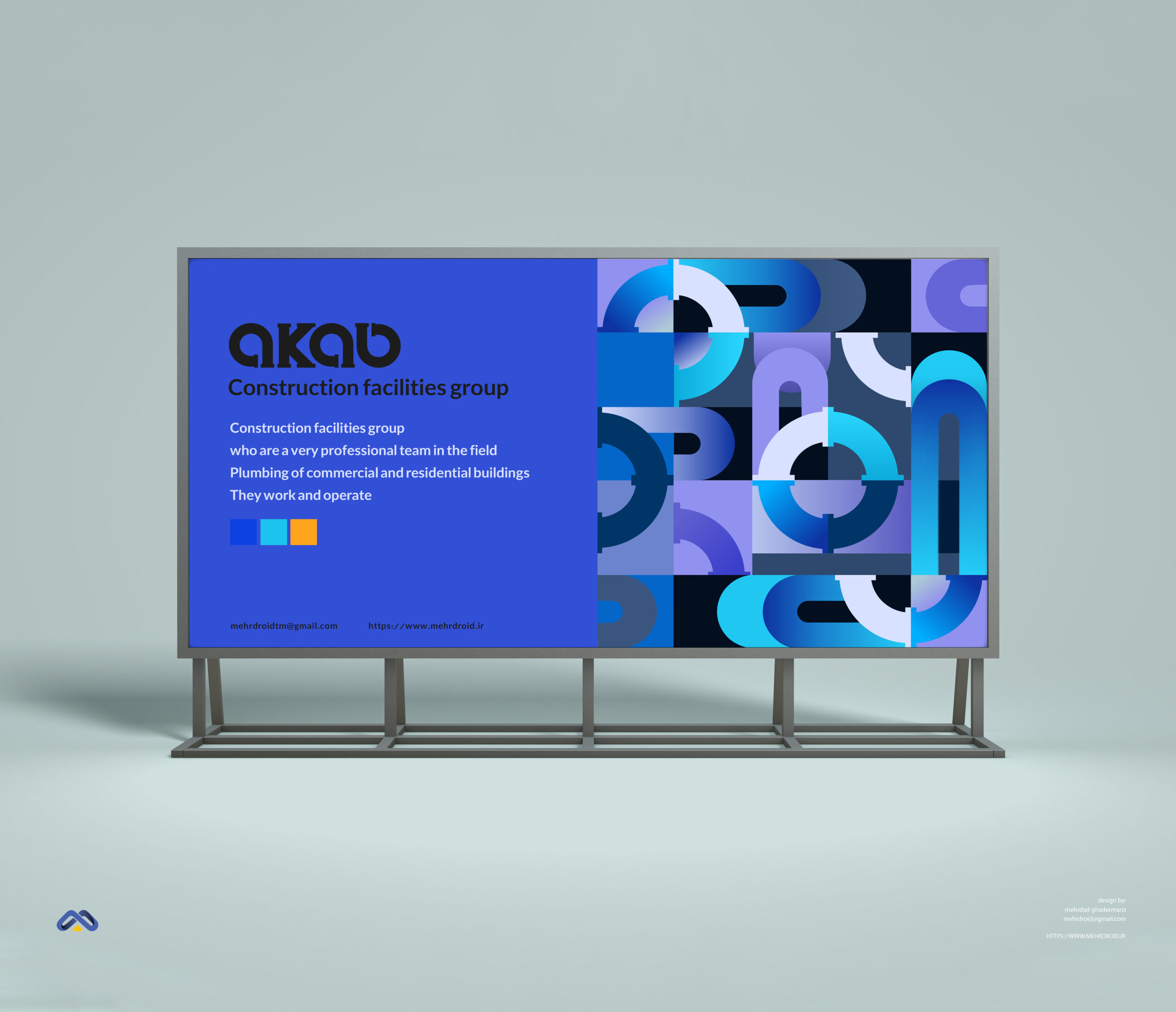
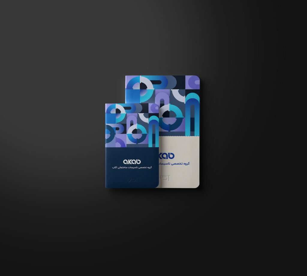
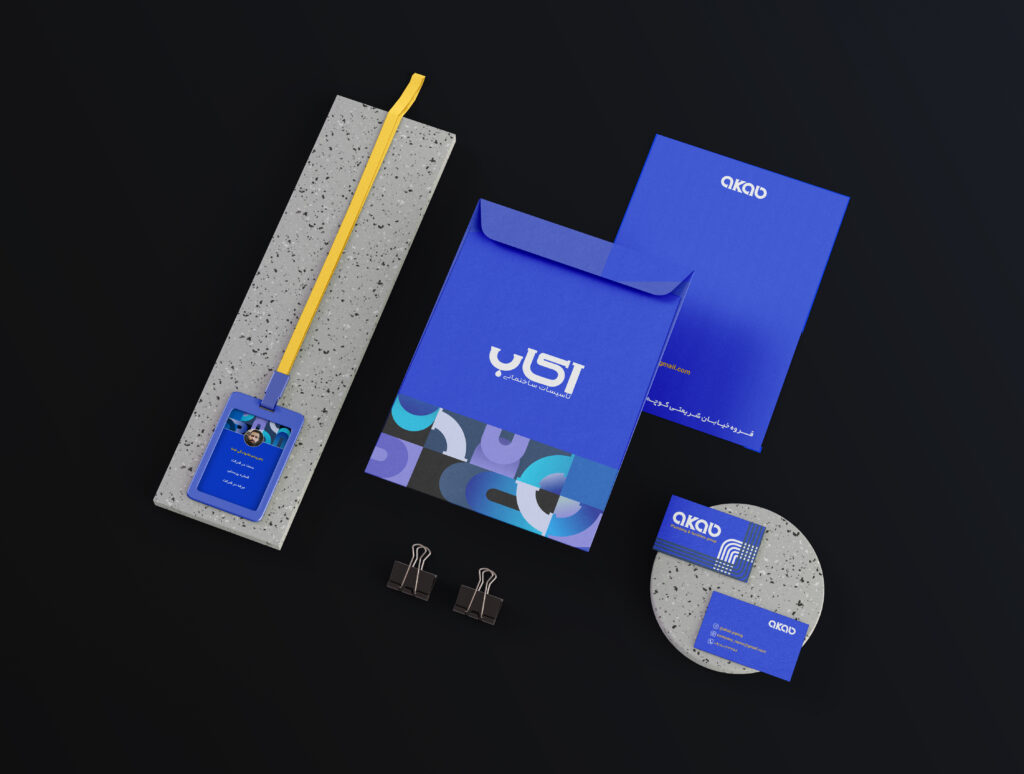
We also used another idea in this design, that is, we designed a special theme for this company so that the company can use this theme in its designs such as brochures, billboards, and office sets.
Copied to clipboard